Audio Visual Resource is an audio and video tech provider for corporate events, venues, and in-home clients. They gained new ownership and wanted a branding refresh to pair with their new start!
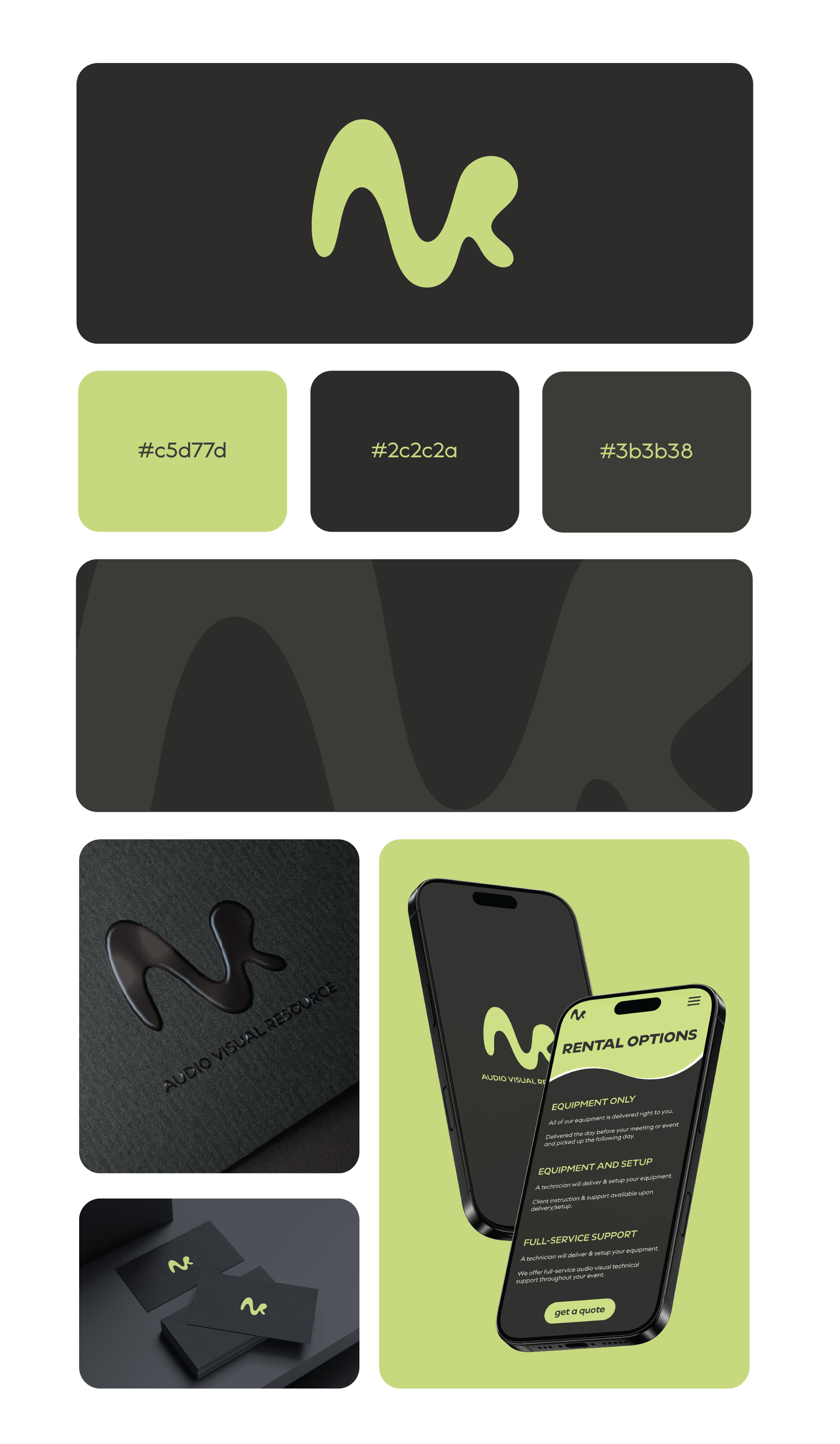
After many sketches and logo variations, here is the final branding!
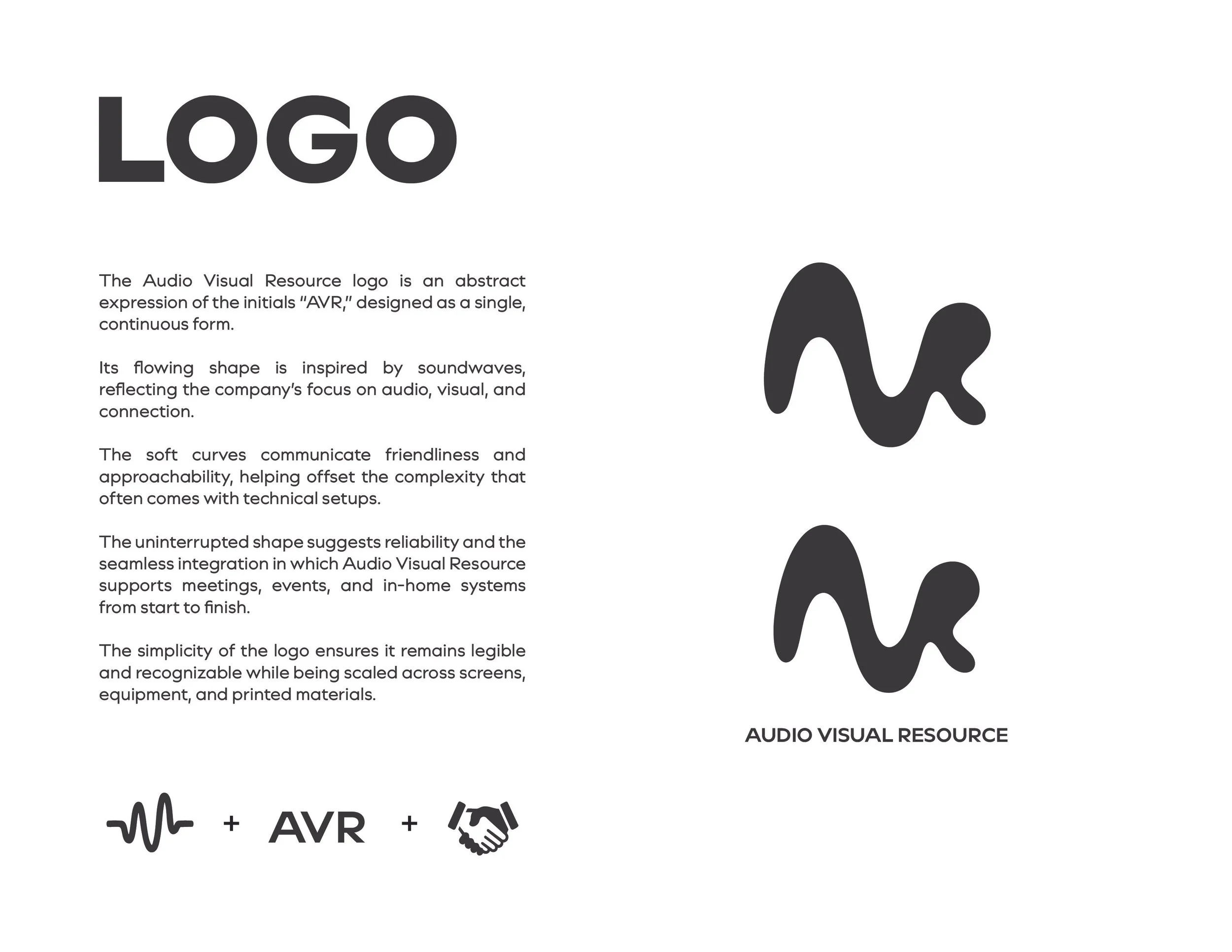
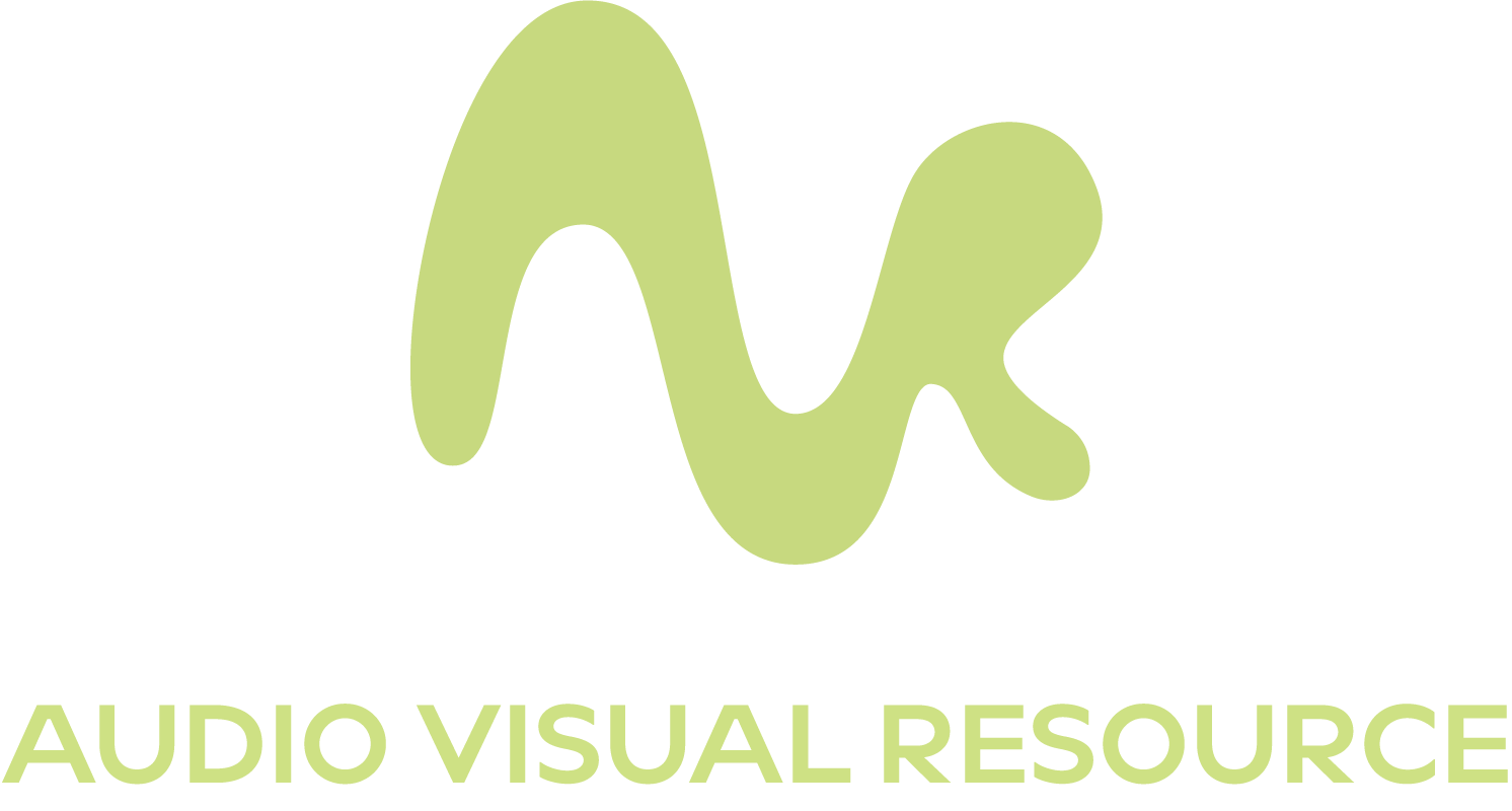
The logo is an abstract expression of the initials “AVR,” designed as a single, continuous form. Its flowing shape is inspired by soundwaves, reflecting the company’s services.
The soft curves communicate friendliness and approachability, helping offset the complexity that often comes with technical setups.
The uniqueness of the logo helps AVR stand out against competitors and communicates modernity and technological advancement.
The simplicity of the logo ensures it remains legible and recognizable while being scaled across screens, equipment, and printed materials which is something the previous branding lacked.
To quote my client,
"I’m kinda geeking out over this design"
The Problem
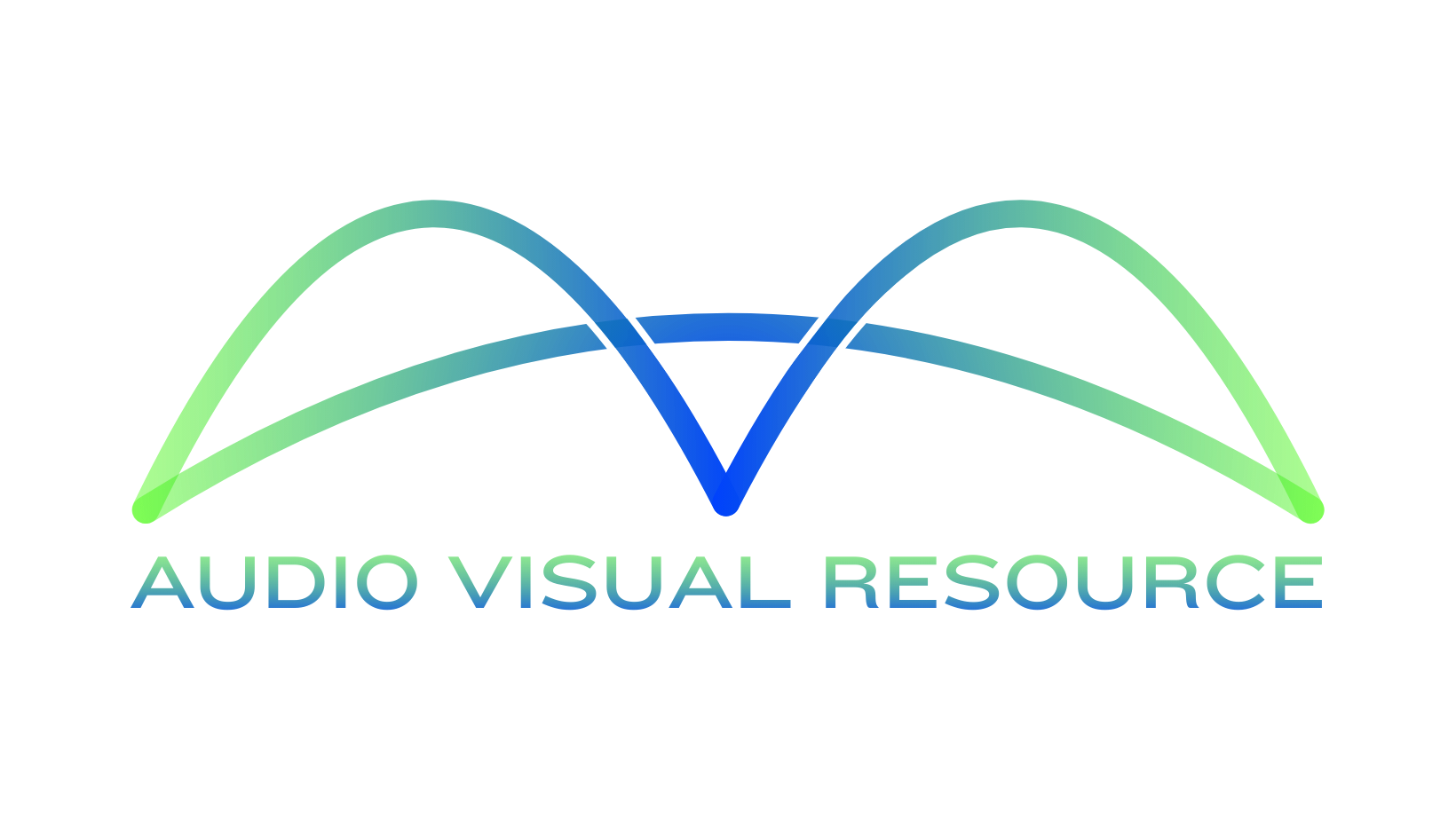
AVR gained new ownership and the new owner wasn’t happy with the current branding. He felt it was outdated and didn’t represent him and the direction he wanted the company to go. He wanted AVR to represent energy, friendliness, reliability and advancement. He tried to design a logo on his own, but discovered it was too wide for social media profile photos and wasn’t easily scaled down or easy to apply onto custom branded merchandise.
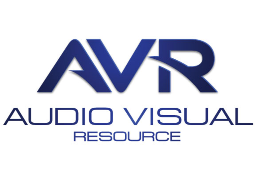
Original Logo
Client’s Logo
My Solution